(Paper-4.png); /* Last, on bottom, like
z-index of multiple backgrounds
Some great advice from Chris Coyier
“It’s not really z-index, but multiple backgrounds do have a vertical stacking order. If you an fully opaque fully repeating image as the first one in the list, none of the others will be visible.”
“I think this is counter-intuitive, because in HTML it’s the opposite. The LAST element is on top naturally if elements with the same z-index come to be overlapping.”
background:

   url(number.png) 600px 10px no-repeat,  /* First, on top,   like z-index: 4; */

   url(thingy.png) 10px 10px no-repeat,   /* Next,            like z-index: 3; */

   url(Paper-4.png);                      /* Last, on bottom, like z-index: 1; */
moz-box-shadow: 0 1px 4px rgba(0, 0, 0, 0.27), 0
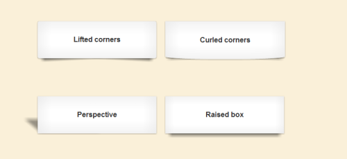
CSS drop-shadows without images
ul.box li {

   list-style-type: none;

   position: relative;

   float: left;

   width: 204px;

   height: 113px;

   padding: 0;

   margin: 0 30px 30px 0;

   background: #fff;

   -webkit-box-shadow: 0 1px 4px rgba(0, 0, 0, 0.27), 0 0 40px rgba(0, 0, 0, 0.06) inset;

   -moz-box-shadow: 0 1px 4px rgba(0, 0, 0, 0.27), 0 0 40px rgba(0, 0, 0, 0.06) inset;

   box-shadow: 0 1px 4px rgba(0, 0, 0, 0.27), 0 0 40px rgba(0, 0, 0, 0.06) inset;

}
ul.box li:before,
ul.box li:after {
content: "";
z-index: -1;
position: absolute;
right: 10px;
bottom: 10px;
width: 70%;
height: 55%;
-webkit-transform: skew(-15deg) rotate(-6deg);
-moz-transform: skew(-15deg) rotate(-6deg);
-o-transform: skew(-15deg) rotate(-6deg);
transform: skew(-15deg) rotate(-6deg);
-webkit-box-shadow: 0 8px 16px rgba(0, 0, 0, 0.3);
-moz-box-shadow: 0 8px 16px rgba(0, 0, 0, 0.3);
box-shadow: 0 8px 16px rgba(0, 0, 0, 0.3);
}
ul.box li:after {
right: auto;
left: 10px;
-webkit-transform: skew(15deg) rotate(6deg);
-moz-transform: skew(15deg) rotate(6deg);
-o-transform: skew(15deg) rotate(6deg);
transform: skew(15deg) rotate(6deg);
-webkit-box-shadow: 0 8px 16px rgba(0, 0, 0, 0.3);
-moz-box-shadow: 0 8px 16px rgba(0, 0, 0, 0.3);
box-shadow: 0 8px 16px rgba(0, 0, 0, 0.3);
}
出典:http://nicolasgallagher.com
moz-transform-origin: 50%; -o-transform-origin:
CSS3 Transform
Some reusable classes for CSS3 transform effects
.rotate-45 { -webkit-transform: rotate(-45deg); -moz-transform: rotate(-45deg); -o-transform: rotate(-45deg); }
.rotate75 { -webkit-transform: rotate(75deg); -moz-transform: rotate(75deg); -o-transform: rotate(75deg); }
.rotate90 { -webkit-transform: rotate(90deg); -moz-transform: rotate(90deg); -o-transform: rotate(90deg); }
.rotate90plus { -webkit-transform: rotate(45deg); -moz-transform: rotate(45deg); -o-transform: rotate(45deg); -webkit-transform-origin: 50%; -moz-transform-origin: 50%; -o-transform-origin: 50%; }
.scale02 { -webkit-transform: scale(0.2); -moz-transform: scale(0.2); -o-transform: scale(0.2); }
.scaleX2 { -webkit-transform: scaleX(2); -moz-transform: scaleX(2); -o-transform: scaleX(2); }
.scaleY15 { -webkit-transform: scaleY(1.5); -moz-transform: scaleY(1.5); -o-transform: scaleY(1.5); }
.skewX10 { -webkit-transform: skewX(10deg); -moz-transform: skewX(10deg); -o-transform: skewX(10deg); }
.skewX30 { -webkit-transform: skewX(30deg); -moz-transform: skewX(30deg); -o-transform: skewX(30deg); }
.skewY20 { -webkit-transform: skewY(20deg); -moz-transform: skewY(20deg); -o-transform: skewY(20deg); }
responsive buttons without the need for
CSS3 Button Techniques
A look at how a little CSS3 can create gorgeous, responsive buttons without the need for images.
It works well in all modern browsers and is best suited
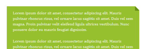
Create a simple CSS folded-corner effect without images or extra markup. It works well in all modern browsers and is best suited to designs with simple colour backgrounds.
出典:http://nicolasgallagher.com
Amazing CSS3 Resources – All You’ll Ever Need to Become a
350+ Amazing CSS3 Resources – All You’ll Ever Need to Become a CSS3 Master! | Webitect

Huge resources about CSS3! Must see…
perhaps combined with a server-side language. Fortunately, the process
Quick Tip: A Crash-Course in CSS Media Queries
In the past, in order to create layouts based upon the width of the user’s browser, we had to use JavaScript — perhaps combined with a server-side language. Fortunately, the process is now becoming far simpler, thanks to CSS media queries.